

Writer: Howard Mackie,
Mark Jason
Artist: Tomm Coker, Keith Aiken,
Octavio Cariello

[ 0.6 ]
Feat: Wolverine, Sabretooth,
Captain Marvel
Issues: 1
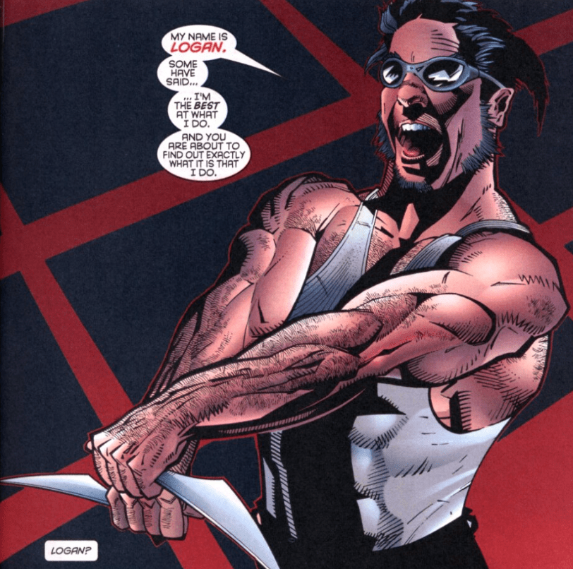
Character designs that change from panel-to-panel.
Published 1996
Would really like to move on from boring comics at some point. Even the 60s stuff is better than these last two. Wolverine is a secret agent with Carol Danvers and they run around trying to uncover the “Mutant Agenda.” No really, look:

And people today still say they love this era of comics and hate how “woke” they are now. The X-Men were designed to be woke, that’s the point of them. Doesn’t matter, this is just a McGuffin to lure Wolverine and Carol to Sabretooth and there’s a fight.
This whole comic is just in the reading order to specifically put Wolverine in the Yukon at the end of the issue. But I think, overall, this one could be skipped because the art is… hard to accept. If I was shown this blind, I would not guess it’s meant to be Logan.


And for some reason, the first time I read this, I thought Wolverine and Carol had good banter. On a second look, it’s all incredibly cliché agent/cop banter that’s well-exemplified by this line:

Its bad. Not a necessary read, even for this reading order, I’d bet. Don’t dirty your eyes with it. I mean, look at this attempt to draw Carol kicking Sabretooth in the nuts:

Is she kicking him… in the side? What’s wrong with Sabretooth’s proportions? Why does his arm look like that? Why is the lion’s-mane-bit of his costume glowing? Reading this comic will just give you more questions.
COMING BACK AFTER ADDING WRITERS AND ARTISTS:
HOW DID THIS TAKE TWO PEOPLE TO WRITE??
HOW DID THIS TAKE THREEEEE
GODFORSAKEN
ARTISTS???

Leave a comment